Explore, 探検

Let’s Talk, どうぞ!

The Product

RightSoft commissioned us to define a clearer, more credible and scalable brand that better reflected their technical expertise and partnership-led approach to software development. Our work combined strategic brand definition with a cohesive visual identity system.

The Goal

We articulated RightSoft’s Brand DNA around problem-solving, systems-thinking, expertise, transparency and long-term collaboration, and translated this into a clear Brand Manifesto, brand personality and guiding keywords for communications and digital channels.

The Brackets

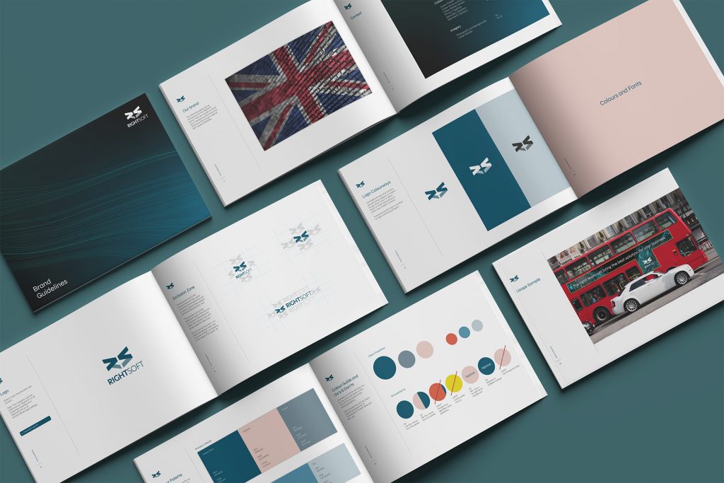
Visually, we designed a distinctive logo system that reinterprets RightSoft’s initials “R” and “S” into a bracket-like symbol inspired by programming languages. The mark works both as part of the full logo and as a standalone icon, ensuring flexibility across digital and corporate applications.


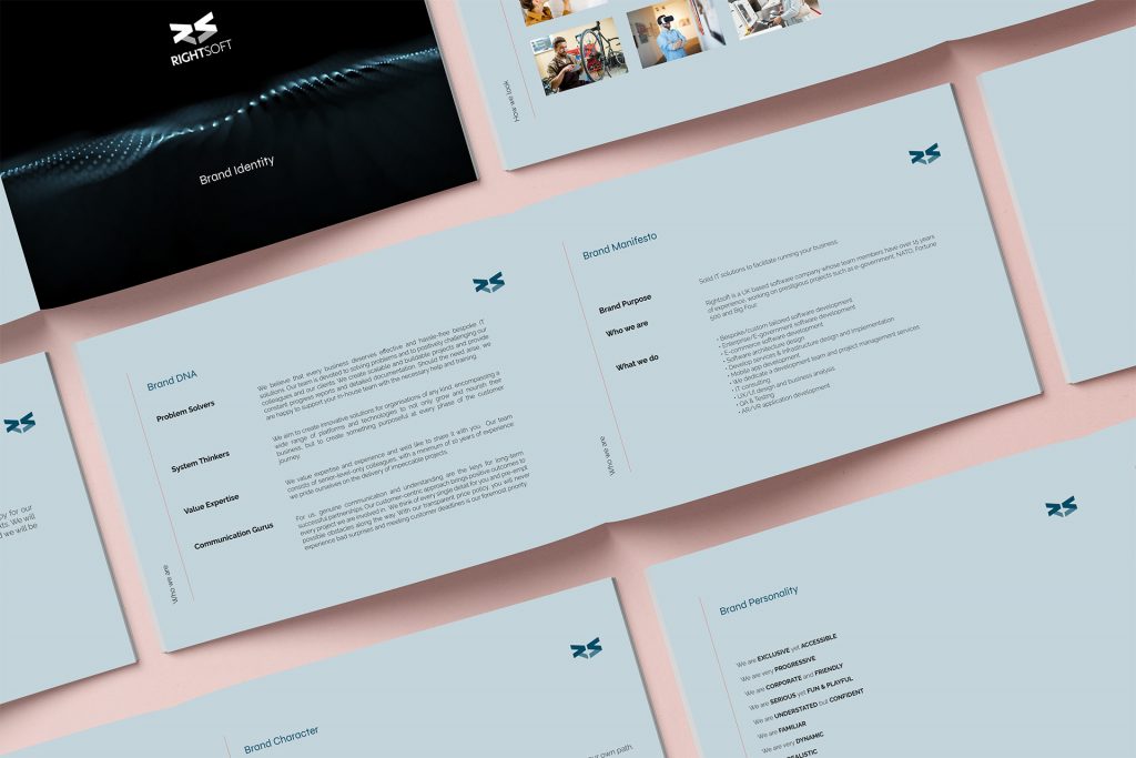
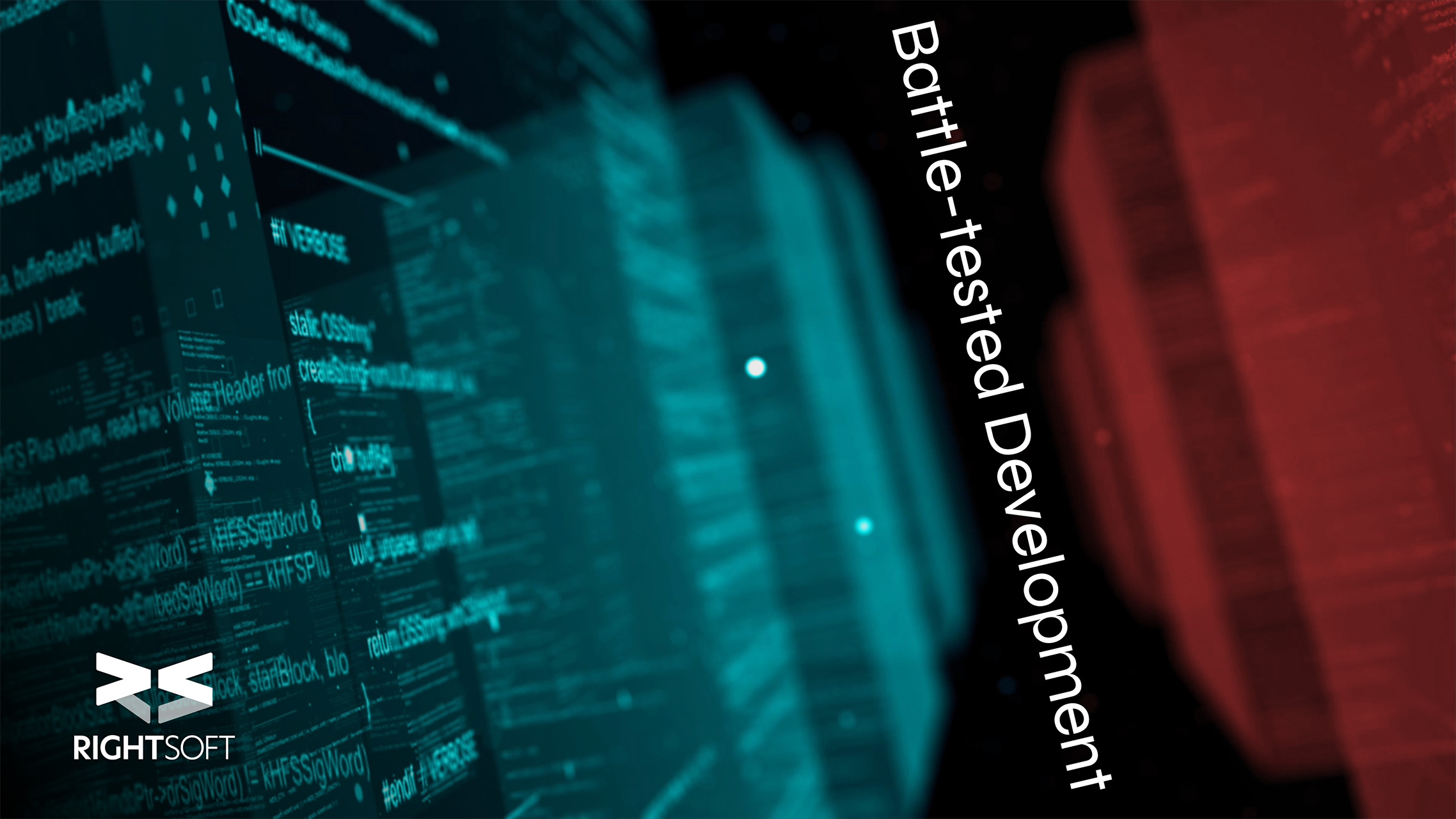
We developed a complete visual identity framework, including a refined colour palette led by Hague Blue, a modern typographic system (Syne as primary, Raleway as secondary, Prata for formal use), and clear imagery principles prioritising people, London-based landscapes and dynamic, futuristic backgrounds.

Our Approach

We delivered a full suite of branded assets — business cards, letterhead, presentation templates, social media banners and sample posts — and consolidated everything into a detailed Brand Guidelines document covering logo usage, colour application, typography, imagery and tone of voice, giving RightSoft a structured and consistent brand system for long-term growth.

Close

Everything your brand wants to express has a design waiting to bring it to life at Hōfu.

BRAND CONSULTANCY AND DESIGN •